
Living Room Color Ideas: 15 Palettes You’ll Love Living With
Picking a color for your living room feels bigger than it should. It’s the room where you binge shows, host friends, and collapse after a long day, so getting the color wrong is a mistake you’ll stare at every single evening. That’s why so many people search for living room color ideas before they even open a paint swatch — they want options that look good in real life, not just in a showroom.
The good news is that you don’t need a design degree to choose well. You just need to understand which colors fit your light, your furniture, and your mood. Below are 15 living room color ideas that cover everything from safe and timeless to bold and unexpected, so you can find the one that actually fits your space.
1. Warm Greige
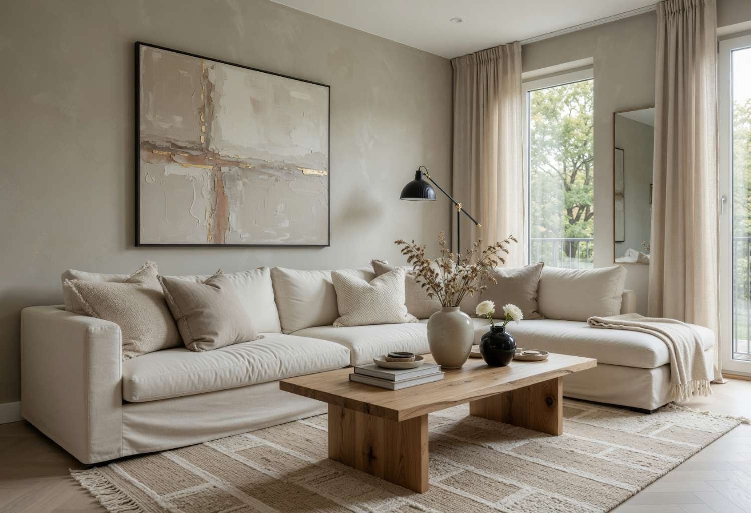
Greige (a mix of gray and beige) has stuck around for a reason — it reads as neutral without feeling cold or flat. It shifts slightly warm or cool depending on the light in your room, which makes it forgiving if you’re not sure how to test paint colors properly. It also pairs easily with wood tones, black metal accents, and almost any color of sofa.
Best for: People who want a safe, resale-friendly base that still feels intentional.
2. Deep Forest Green
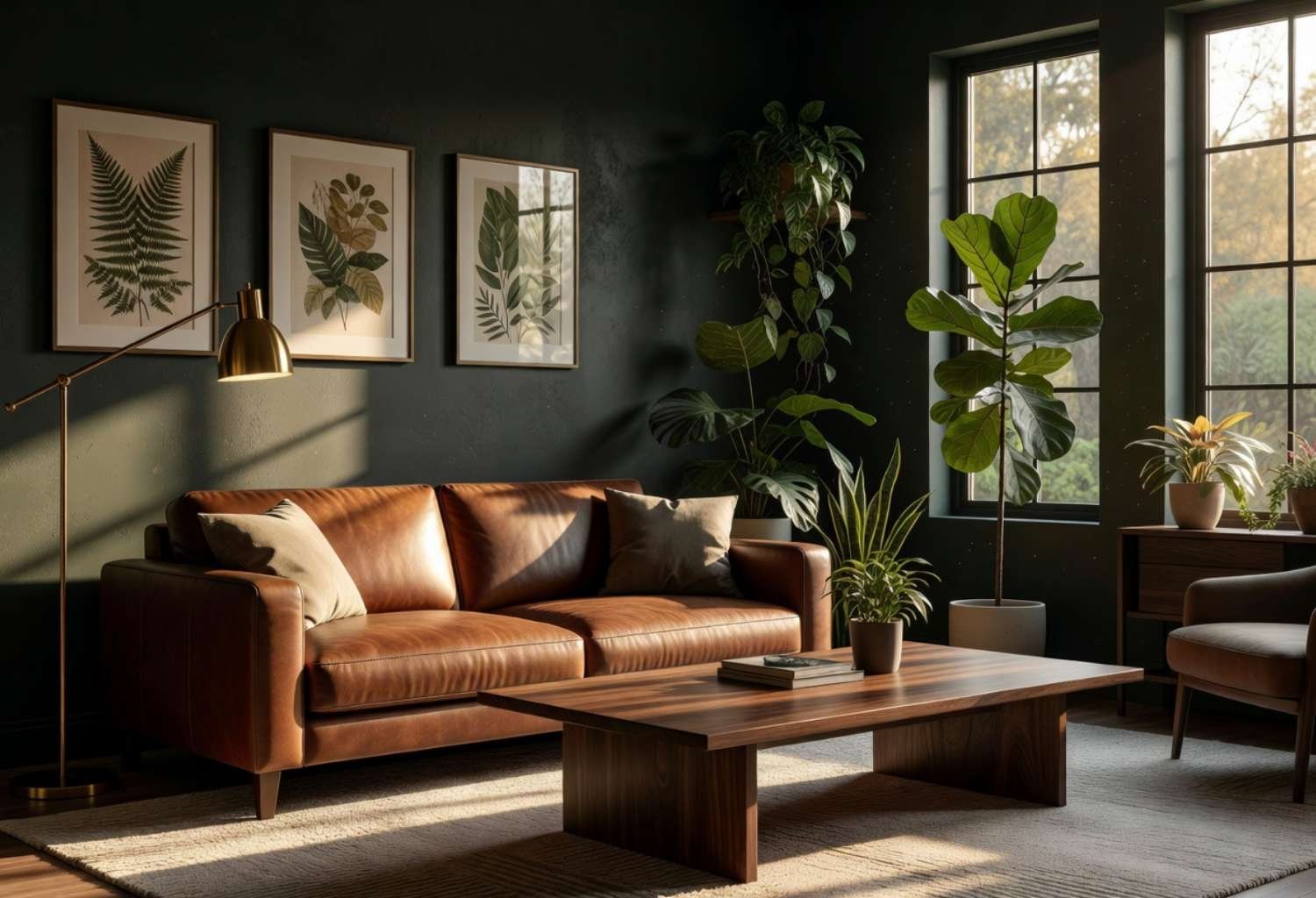
Forest green brings the outdoors in without turning your living room into a jungle theme. It works beautifully on all four walls in a room with good natural light or as a single accent wall paired with brass or gold hardware. It also plays well with leather furniture and botanical prints if you’re leaning into a moody, earthy look.
Best for: Anyone wanting a bold color that still feels grounded and calm.
3. Soft Terracotta
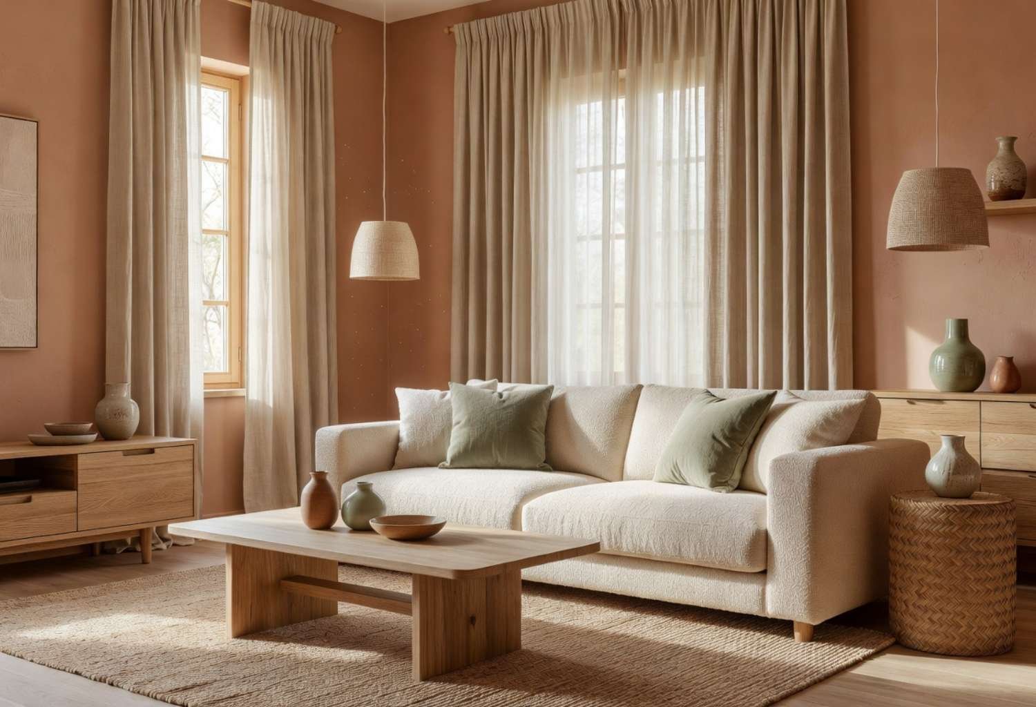
Terracotta has moved beyond Southwestern decor and into modern living rooms as a warm, welcoming alternative to beige. It adds warmth to rooms that get a lot of cool, north-facing light and pairs naturally with cream, sage, and rattan textures. It’s a great pick if your current room feels sterile and needs some life.
Best for: Rooms lacking natural warmth that need a cozy boost.
4. Classic Navy
Navy blue gives you drama without the commitment of black. It looks sharp against white trim, works well in both traditional and modern spaces, and hides scuffs better than lighter colors. Many designers use navy on a single wall behind a sofa or media unit to create a natural focal point.
Best for: Anyone who wants a bold accent wall that still feels sophisticated.
5. Warm White
Not all whites are created equal, and a warm white (one with slight yellow or beige undertones) avoids the cold, clinical look that stark white can create. It reflects light beautifully in small or dark living rooms and makes a great backdrop for colorful furniture, art, or textiles you want to rotate seasonally.
Best for: Small or low-light rooms that need to feel bigger and brighter.
6. Muted Sage Green
Sage green sits in that sweet spot between green and gray, which makes it far easier to live with than a bright, saturated green. It has a calming, almost spa-like effect and works particularly well in living rooms that connect to a kitchen or dining space, since it ties into natural wood cabinetry.
Best for: People who want a color that feels fresh but still relaxing.
7. Charcoal Gray
Charcoal is a strong choice if you want depth without going fully black. It makes a striking backdrop for gallery walls, gold frames, and statement lighting, and it hides dust and marks far better than lighter grays. Just make sure the room has enough windows or lamps, since charcoal absorbs a lot of light.
Best for: Well-lit rooms that can handle a dramatic, moody backdrop.
8. Buttery Yellow
A soft, muted yellow (think butter, not neon) brings genuine cheerfulness to a living room without feeling like a kid’s playroom. It’s especially effective in rooms that don’t get much sun, since it mimics warm light even on gray days. Pair it with white trim and navy or green accents to keep it grounded.
Best for: Dark or north-facing rooms that need an instant mood lift.
9. Dusty Blue
Dusty blue is softer and more muted than a classic navy or sky blue, which makes it easier to pair with existing furniture. It has a calm, slightly vintage feel and looks especially good with brass fixtures, linen fabrics, and mid-century furniture shapes. It’s a solid middle ground if navy feels like too much.
Best for: People who like blue but want something quieter than navy.
10. Warm Camel or Tan
Camel and tan tones bring in warmth without leaning as pink or orange as terracotta does. They work well as an all-over wall color in living rooms with leather furniture, wood beams, or a mid-century modern layout. This palette also photographs well, which matters if your living room doubles as a home office backdrop for calls.
Best for: Rooms with lots of wood or leather that need a cohesive base tone.
11. Black Accent Wall
A single black wall sounds intimidating, but used behind a sofa or fireplace, it acts almost like a frame rather than a full room color. It makes artwork, plants, and light fixtures pop, and it works in both small and large spaces since it’s not covering every surface. Balance it with plenty of light-colored furniture and textiles.
Best for: Design-confident homeowners who want a striking focal point.
12. Blush or Dusty Rose
Dusty rose has shed its overly feminine reputation and become a genuinely versatile neutral-adjacent color. It pairs surprisingly well with charcoal, forest green, and warm wood tones, giving a room softness without feeling saccharine. It works especially well in living rooms with lots of natural light, where it can look almost peachy.
Best for: Anyone wanting warmth and softness without going full pastel.
13. Olive Green
Olive sits between green and brown, giving it a richer, more grounded feel than sage. It’s a great choice for living rooms with a lot of natural materials—think linen, jute rugs, and wood furniture—since it echoes those earthy tones rather than competing with them. It also ages well and won’t feel trendy in five years.
Best for: Nature-inspired or organic modern living rooms.
14. Two-Tone Color Blocking
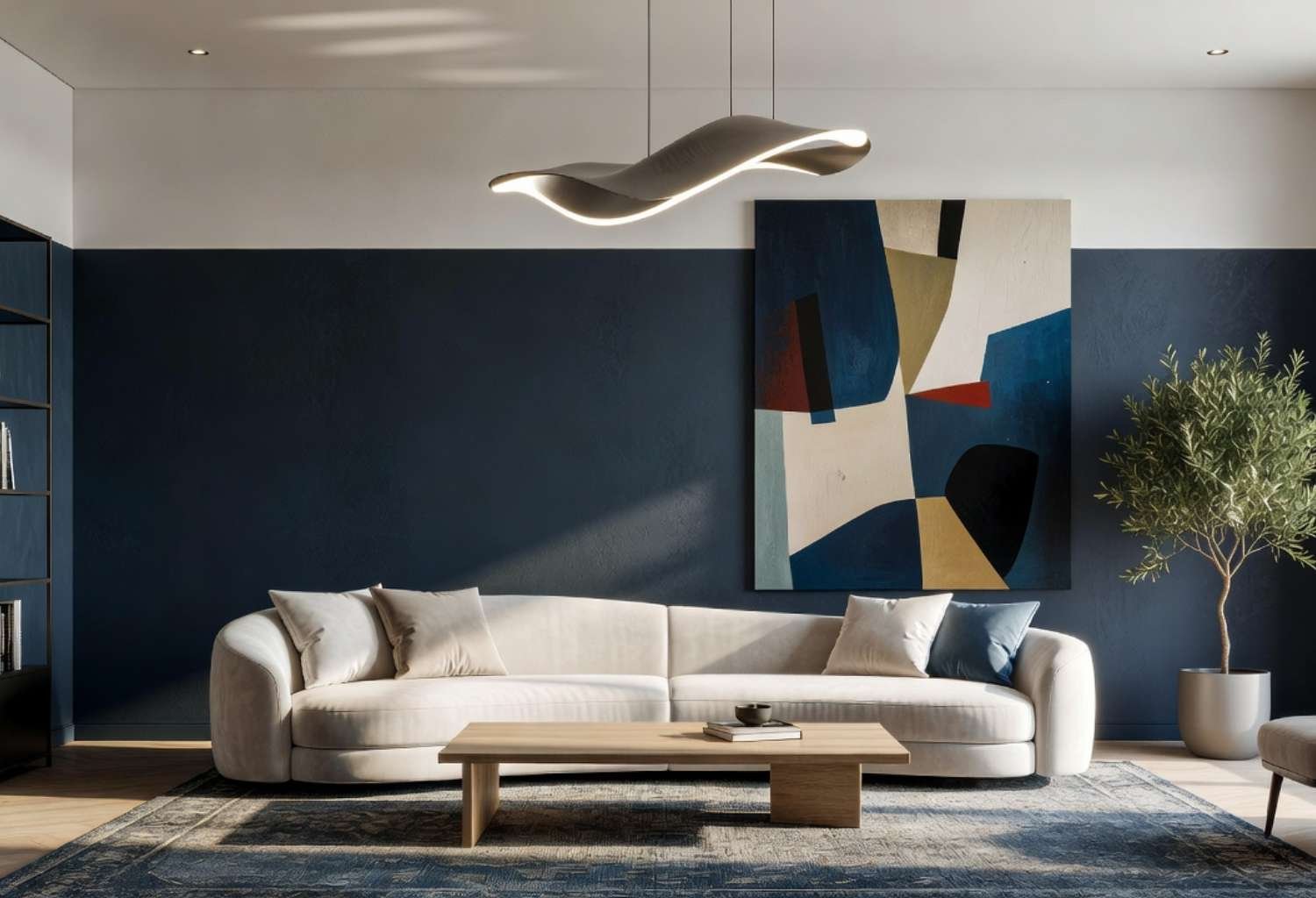
Instead of picking one color, color blocking uses two complementary shades split horizontally or on different walls. A common combo is a darker color on the lower half with a lighter one above, which adds visual interest and can even make ceilings feel higher. This technique works well if you want personality without repainting the whole room later.
Best for: People who want a designer look and don’t mind a slightly more involved paint job.
15. Soft Gray-Blue
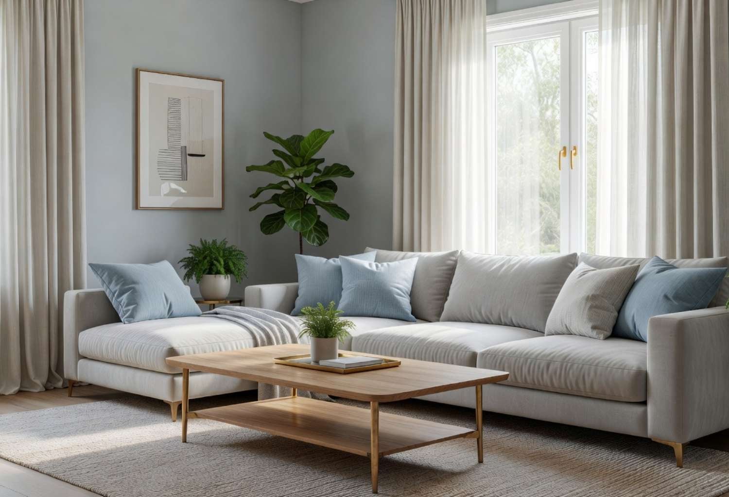
Gray-blue is one of the most versatile living room color ideas because it changes personality depending on lighting—cooler and moodier at night, softer and calmer during the day. It works with almost any furniture color and is a favorite among people who like to swap throw pillows and art seasonally without repainting.
Best for: Anyone who wants a color that adapts as their decor style changes.
Conclusion:
Choosing among these living room color ideas really comes down to your light, your furniture, and how bold you’re willing to go. A north-facing room with limited sunlight will always behave differently than a sun-drenched space, so test a few sample swatches on your actual walls before committing to a full gallon. Whether you go moody with charcoal, warm with terracotta, or safe with greige, the best color is the one that still makes you happy to walk into that room every day.
